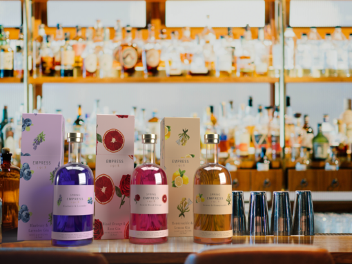
Empress Gin Spring Collection

Design Narrative
Package Design, Social Media, 3-Dimensional Mock-Ups.
Empress is a brand that only provides one product of an iconic hand-crafted gin. This product is distilled with butterfly pea flowers which gives the product a long-lasting impression on its consumers. The design challenge of this product line is to create a line of differentiation and variety to their brand by releasing a spring line of ‘spring flavored’ gin. The main concept is to build upon the existing brand by giving them a variety of products as opposed to one single product, and seasonal at that. The color choices within these products are meant to feel light and airy. The typefaces chosen for the packaging on these products are Avenir Next Regular and Bely Regular which both match some similarities to the original branding of Empress Gin. The target audience of this product is those who are of age to drink alcohol (21+), and those who enjoy artistic patterns and designs on their packaging for products. There is not a specific age, nor income for these products. The design goal for this project is to create a more vibrant and expressive package design for Empress Gin while also aesthetically following some of their brand guidelines. The package design will have an expressive pattern that includes the ingredients and flavors that each Spring Edition of Empress Gin includes. The ingredients used in these products will primarily be focused on florals and fruits to embody the essence of springtime. 3D mock-ups were created to show what each bottle and box would look like as a packaged set. Empress Gin’s Spring Collection is promoted primarily on Pinterest by sharing recipes that can be created using this new line of flavored gin.

Die Line Patterns for Boxes & Labels:

3D Mock-Ups:


Pinterest Recipe Ads: